On that note, I would like to point out my current thoughts on future improvements.
1. Charts: The first gridviewer used the pin info windows to display region specific chart data. We maintained that in the 2nd release. The issue with this design is the info window is too large for the scale of the map. It is my opinion that we move the chart out of the map completely into a dynamic layer around the form. This would prevent all the dragging of the map to see the whole chart.
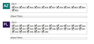
2. Primary navigation: I waver on how important the map actually is to the user. When I first began working on gridviewer, my original impression was the map should serve as the primary navigation, meaning they should use the map for drilling into all the query results. Now I actually believe the map is really a subordinate to the query result boxes (see image below). My opinion is we should expand the current boxes to include more informative data results such as simple bar charts showing zip totals, or possibly show a sparkline for each respective zip. A user should be able to click on AZ, get a chart for that collection as well as have the map zoom into that respective region. As the user selects items either pins on the map or check-boxes in the query boxes, each respective control is responding that event accordingly, meaning the map zooms in and out and the chart data changes based of the selected region. As others have mentioned, a data download should be available per query box as well.

3. Form
I wonder if we could reorganize the form selection box to have an "advanced options" selection which would reveal(show/hide) the age, dispositions and service areas. It seems that age and dispositions could default to all and service areas should mostly be driven by the classifier selection. It would be less intimating to the user and also would provide more space.
4. Comments
One suggestion was for commenting which I am really in favor of. I believe before we implement this we must have the ability for people to generate links to a saved query. It would not be a large hurdle to have one URL per query (box), but to have a single URL for multiple queries is going to represent a challenge. We could look to using something like ShareThis once we have the URL issue worked out.


No comments:
Post a Comment